Overview
The Order of St John is a global charity, and defines itself as a working Order of Chivalry, delivering first aid, community healthcare and support services around the world.
We have 164,000 volunteers worldwide, and in 2023 we responded to 1.8m emergencies, and trained 1.1m people in first aid. We operate in 44 countries and territories, mostly within the Commonwealth, and are the parent body to St John Ambulance services.
The purpose of St John International is to facilitate the global narrative and governance of St John services, and provide support based on individual assessments of the current activities and needs of our local organisations and establishments.
A new website was required to better meet our needs as a diverse and growing global organisation, aligned with our #OneStJohn strategy.
Established in 2006, Hotfoot is an award-winning creative agency with extensive experience working in the charity and public sector to create brands, websites and campaigns with impact for clients including Age UK, Citizens Advice, the NHS, Sport England, Windermere Jetty, Cincinnati Shakespeare Company and many others.
Context and Challenge
Our website was clunky and difficult to navigate. It was a challenge for website users to find the content they were looking for – which in many cases was needed promptly. Our important pages were hidden within the website – including our #OneStJohn values which took numerous clicks to find.
The visual and written content on the website was also largely inaccessible to a range of audiences – including those with impairments, but also international audiences where English was not their first language. At times, the website didn’t tell our story in a way that was easy to understand and the tone of voice was inconsistent and over-technical. As we are a global charity, it wasn’t clear where we operate – we needed a clear, interactive way to communicate and signpost our presence around the world.
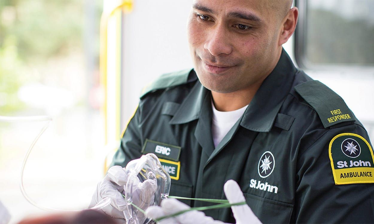
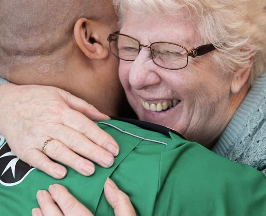
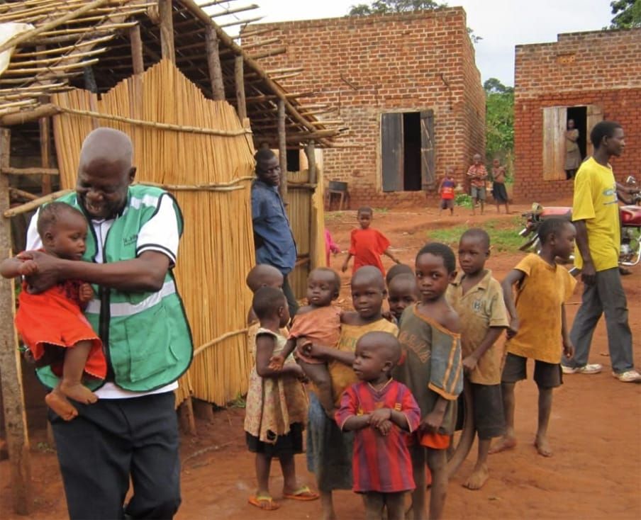
The photography on our website didn’t accurately represent who we are and what we do, and the design of the website was old-fashioned and not very engaging.
The website wasn’t a fair reflection of the work we do at the International Office, or the work our St John colleagues achieve around the world. We were paying a large fee to an external organisation who hosted our website, with no access to any of the backend design or analytics. We wanted to move to a WordPress CMS Platform as we recognised this needed to be more accessible and user-friendly in order for internal teams to update the website content and add new pages when needed.
Process and Insight
We identified that, in our refreshed team, we shared WordPress knowledge and experience, and we were all in agreement that it was a CMS that we were comfortable with using. With this in mind, we worked together to write a short brief to share with a number of website design agencies. We wanted the new website to be able to define clearly what it is we do at the International Office, and what each of our St John establishments do. We knew we were looking for something that felt more vibrant, easier to navigate and concise – our former website had over 300 pages and a lot of unnecessary content.
We wanted to avoid the feeling of having to navigate what felt a bit like a marshmallow cloud – there were lots of busy amounts of text, but nothing really seemed to explain anything, and the organisation of our content felt like it had become rather out of hand.
We felt an interactive map was the best visual approach we could offer to showcase exactly where our work takes place around the world, and we wanted to be able to filter the activities to best spotlight how many St John establishments run an Ambulance service, for example, and how many offer a Mother and Baby Programme.
We met and interviewed some 5 potential design agencies. It seemed we had a clearer idea of what we wanted the new website to look like than we had initially realised and, in the end, our choice of contractor was very easy.
We chose Hotfoot for multiple reasons:
Hotfoot just seemed to “get it”; in the meetings we had to discuss the brief and what was possible, they were able to wrangle what we were looking for from our multifaceted explanations (we’re a very multi-disciplinary team with many ideas) and explain it back to us in a concise, simple way.
They felt like a safe pair of hands, but one which was also ambitious and creative. This was the first big project our team would be tackling together and we were cautious of the amount of money we were investing, and the time we would need to take to get this right. Hotfoot made what we wanted feel achievable, even when we were still feeling stuck fighting the marshmallow.
Crucially, they understood the need for a map. Every other agency we spoke with advised us against the design of the map; they felt that it would be too unwieldy and better as either a list of links, or another less visual approach. We were determined that what was missing was a visual, interactive explanation of our work. And Hotfoot understood this from the get-go.
As part of Hotfoot’s process, they created a stakeholder survey, which we shared with our Senior Leadership and Communications Colleagues around the globe. As our website’s primary audience, it asked what they liked about our current website, and what it was that they felt could be improved, or was missing. We also asked who they felt our website’s target audience was. Their feedback suggested that we were on the right track: they asked for a more vibrant, more concise website that felt easier to navigate. They thought our audience was anyone interested in St John – ranging from volunteers who might want to know more about their global family, to governments who may want to understand more about our international work… challenge accepted!
The Solution
We had agreed with Hotfoot that we wanted them to concentrate on the design of the new site, and we would manage the content. We wanted to really condense down what we shared on our new site, so that it was as simple to understand as possible and easier to share. With Hotfoot’s help, we agreed on a stripped back sitemap with many fewer pages. They then moved onto designing the Homepage as we concentrated on condensing our content.
A lot of time was spent on getting the Homepage right – we wanted it to be a vibrant, exciting landing page for our visitors. The final design was shared with our International team to make sure they felt that it represented their organisation, and with our Great Officers for their sign-off.
Hotfoot first provided wireframes, which are ‘designless’ blueprints of the pages structure and key content messages. This is a valuable step to take to make sure the page says what we want it to say, without being overwhelmed by design decisions. Once the wireframe was approved, Hotfoot took on our existing brand guidelines and built on them to provide us with a Homepage design that was distinctly ‘St John’, but with an updated and modern feel for web use.
Both the wireframe and design were supplied for feedback on prototyping software, so we were able to get a feel and understanding of the website before a line of code had been written – this means that changes can be highlighted and made quickly.
Once the wireframe and design was signed off, it was full steam ahead with the other page designs – then finally building the website itself. This entire process took us from briefing Hotfoot in September, signing the contract in October, signing off the first designs in March, to launching the new website in June.
Hotfoot supplied the fully functioning new website on a staging area, hidden from search engines. They also provided training on using the WordPress CMS – there is a wide variety of WordPress editing platforms, and Hotfoot made sure ours was as intuitive and user-friendly as possible. Using the CMS logins on a staging area meant we had the opportunity to review and amend the website before sending it for wider review.
Finally, once the website was ready for launch, it was important to review the old sitemap and set up redirects that ensured both users and search engines were still able to access the site through any prior saved links.
We wanted our website to be a landing page/reception area for anyone looking to find out more about the work of St John. We didn’t want to replicate each establishment’s own webpage, but to make those easier to find and visualise (via our map) than before. We receive an annual Measurement Exercise from each establishment every St John’s Day, which lets us know their previous year’s volunteer numbers, types of services and biggest achievements. We will then take that feedback to update our webpages, meaning that establishments are not asked multiple times a year if we’ve got the right data! (They can of course update us at any time!)
Following a two-hour workshop, Hotfoot also worked with us to produce a Tone of Voice Guide that can be used by all establishments, teams and partners around the world, making sure our international voice is consistent and accurate across all platforms and channels.
The Conclusion
We are utterly delighted with our new website from Hotfoot – we’ve received really wonderful feedback from our wider St John family who say they love the vibrancy, the person-centred visuals and stories, and that this website makes them feel proud to be part of our international network. It truly represents our #OneStJohn strategy.